Tag Archives: #mckinneybusinessphotos

Make the Most of Your LinkedIn Headshot

We take hundreds of headshots each year so we know a bit about LinkedIn headshots. To help make sure you get the most out of your new LinkedIn headshot, we wanted to share these tips with you.

Linked-In Headshot Tips
  1.  Zoom In – Linked in isn’t an app focused on sharing quality visual media. Generally, it’s about networking. It doesn’t have the ability to view, inspect, and enlarge photos like some of the other social media apps. This means that your profile photo is TINY. Even if you do happen to click on someones profile photo, it doesn’t really enlarge that much. Make sure that you crop in as tight. We will give you multiple crops of your headshot including one for LinkedIn. Be sure to ask Kurt if you’re interested in this. You will make sure that people can see your face while they are scrolling.
  2. Keep it simple – There is a big difference between branding photos and a LinkedIn headshot.  Given that, in a branding photo, you may want to consider something with an interesting background or scene if your image is being featured in a magazine or on a website. Alternatively, your LinkedIn profile photo is a tiny little “hello” to show off your face and expression. It’s hard to get that across if your head is two pixels wide and you are surrounded by plants. Accordingly, stick to a solid, out of focus, or non-distracting background. Let your face be the focus of the shot and don’t forget to zoom in. 
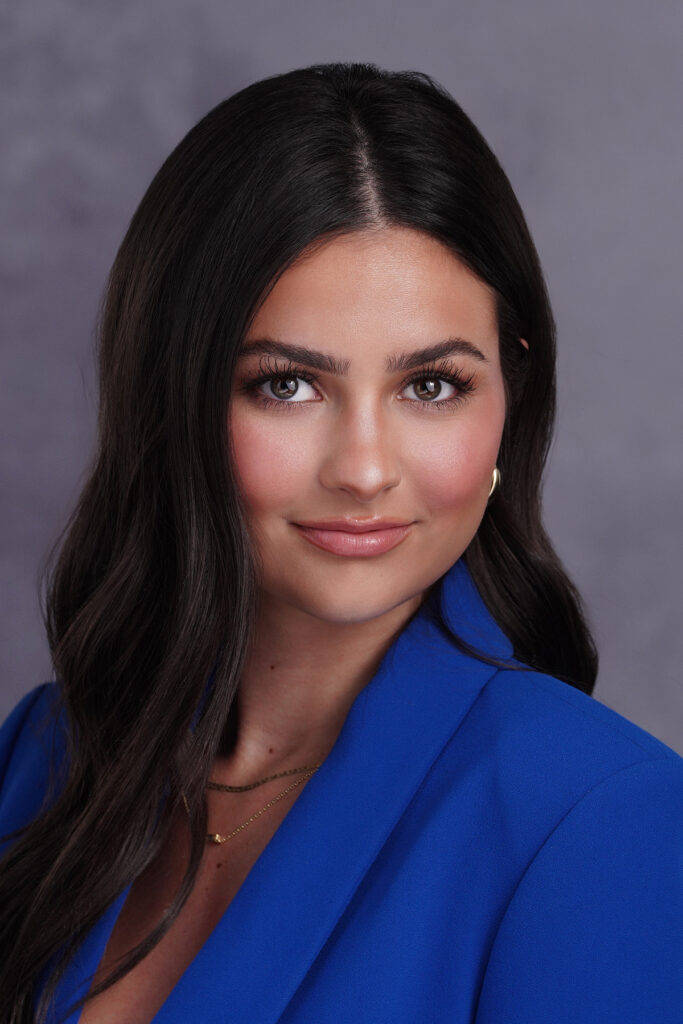
  3. Try a pop of color – I can tell you after 15 years in the business, that the most popular background color for a headshot is WHITE. One reason is that companies like all their employees to have a matching background and white is universally offered. I will say that unless the photographer knows what he/she is doing, your white background may end up being a mess. As you know, there are thousands of shades of white. A professional will make sure the white is 100% true. We prefer a neutral gray, but know many of you request white, so we do it frequently. Since so many people use a white or light gray background, you can make your LinkedIn headshot stand out by wearing a pop of color. Catch the eye of people scrolling by your post with something extra by including a colorful blouse or tie in your next headshot session. You could purchase two poses during your headshot session which could include a more traditional color scheme and another with the pop of color.

Make sure that your headshot is impactful, recognizable, and stands out from the crowd if you are really looking to polish up that LinkedIn profile,

Need an Updated Headshot?

That being said, need to update your Linked Headshot or business headshot? Use this link to BOOK NOW!


Skin Tone and Color Selection for Headshots

Are you contemplating what color(s) you should wear for your headshot session? You are not alone! One of the most time-consuming parts of preparing to be photographed is deciding on the outfit you want to be wear. Below, we have outlined how to get started with the most important part: choosing your colors.

First of all, check with your company to make sure they don’t require a certain color. It is wise to select something that will look great with your company logo. For instance, if your company is red and navy, a poor choice for your clothing is pink because it will clash. In addition, you may want to identify which skin tone category you fall into — warm, neutral, or cool.

First, take this quiz!

Then, do the vein test!  Check the veins around your wrist & palm:

  • If they appear greenish, you have warm tones
  • If they appear blue or purplish, you have cool tones
  • If they appear colorless or match the skin, you have neutral tones

Also, you can determine your skin tone by recalling the way your skin reacts to the sun:

  • If you tan easily, you have warm tones
  • If you are able to tan or burn, you have neutral tones
  • If you burn easily, you have cool tones

Complementary Colors for Warm Skin Tones

Orange, Honey, Amber, Gold, Olive, Turquoise, Cream

Avoid vibrant tones like Deep Red and Indigo. Some of these colors are quite harsh for headshot photography (bright orange) but  could look great under a jacket as a camisole for women or in a tie for men. Do not confuse the turquoise for royal blue!

Complementary Colors for Neutral Skin Tones

Light and soft colors like Rose, Jade, Gray, Sky Blue

Avoid Neons, Yellows, and Reds.

I see the above color choices as a secondary color selection under a jacket, etc. Gray is ALWAYS a better choice that white as the secondary selection. AVOID WHITE no matter what your skin tone is!

Complementary Colors for Cool Skin Tones

Emerald, Ocean Blue, Purple, Lavender, Cherry Red

Avoid Orange and Yellow. Who would want those colors anyway in a professional headshot?

Evoto

Business Photos

They say that a good headshot is the new handshake. Think about how much people nowadays are looking at photos….putting a fresh, friendly, professional face out in print and online is VITALLY IMPORTANT to business. What constitutes a great business photo? 1. It reflects your unique brand. 2. It is current – avoid using something that is over 5 years old. 3. It reflects who you are and what you do.. 4. It conveys Quality and Professionalism. 5. It establishes eye contact. Eye contact draws people in and engenders trust. Are you starting to see the importance of your headshot? How do you get a quality headshot? CALL A PROFESSIONAL! It is obvious when someone is using an unprofessional image with poor quality. I recall seeing an ad for a local insurance agent recently that read, “Unsure? Insure! The picture of the agent was completely awful with an expression that portrayed uncertainty. There is no way I would have called this agent for insurance when she looked absolutely unsure and unhappy.0C3A1339crRet-HR

MichelleStewart

LawrenceKennedy

JennniferYang3

Fears

DrewCase2

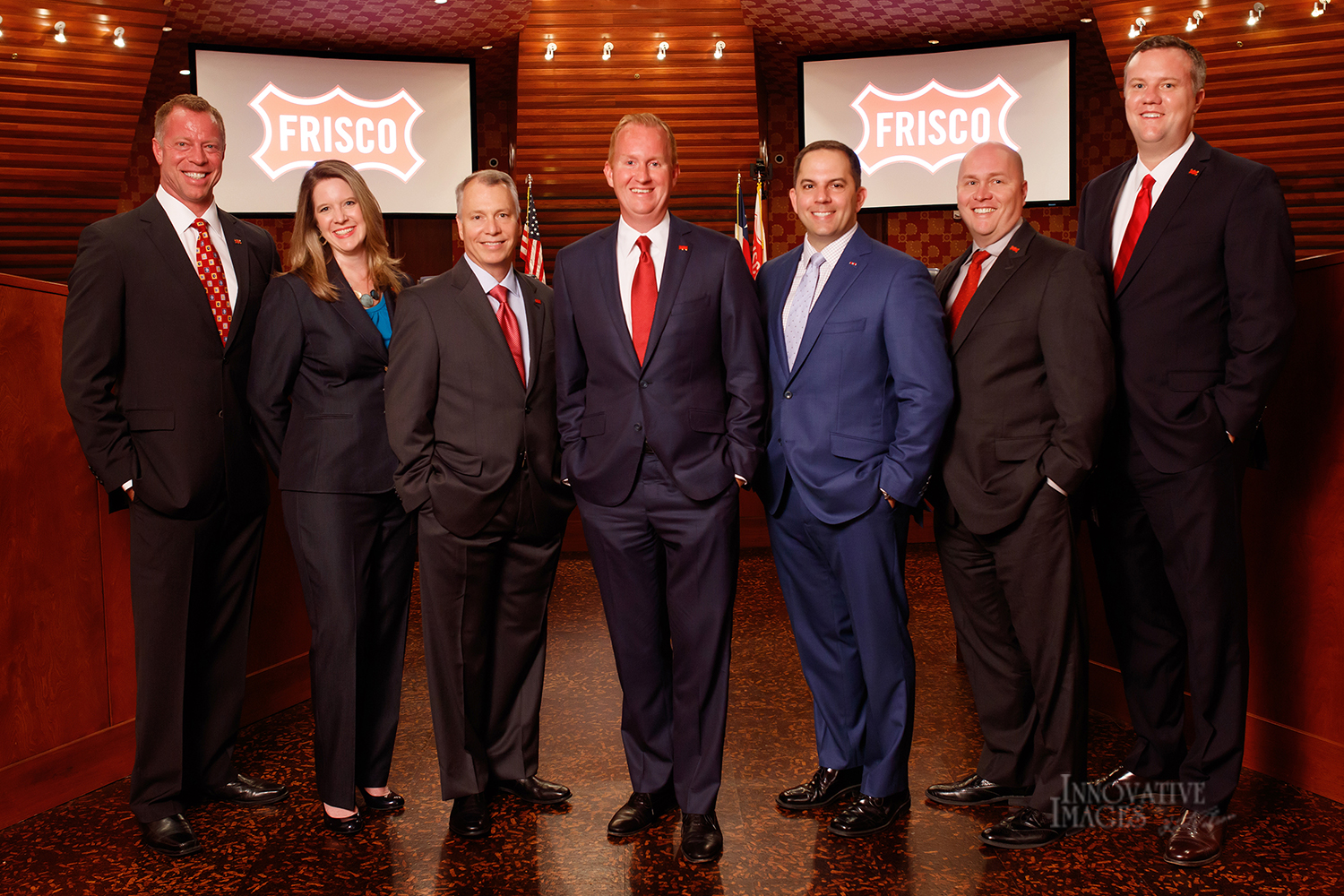
095_FriscoCC_062017cr2-8x10